Recently I was introduced to two sources: Snpedia.com and James Licks haplogroup reader. Originally I began an excel chart looking for a map/result of correlating my major rcrs differences to known markers of each subclade. When I completed my cursory search and had found only some related to the in typed mutation I was quite disappointed. Through a happy coincidence I searched that marker coming across a blog post which indicated James Licks haplogroup reader using phylotree data. Indeed I had found what I was looking for! When I third party transferred and took my mtDNA test with Family Tree DNA they had not yet differentiated the basic and full sequence test so while I thought I was getting a awesome deal I was indeed being short changed. For most people knowing your major haplogroup is probably very helpful. The general information will no doubt apply to at least part of your research and you may choose to look no further. In researching H I began to try and guess which subclade I might be. I began to notice that much of the research on Haplogroup H was inconsistent. When I first looked it up I was told H stood for Helena featuring most women found in the area of Greece and Turkey. More recent clippings will tell you it is actually a young line found in Norway and Scotland....the inconsistency being an east or west haplogroup.
Running the James Lick emulator for my true subclade has been invaluable to discerning not only my origins but also understanding why information is so distorted suddenly on the topic of line H. The result from inputting my hrv1 and hrv2 differences was H2a2a1g. Major research has been done recently in recovering that haplogroup from the eurocentric viewpoint and possible selection biases. My own upper subclade of H2 is perhaps one of the least European of all the H derivatives with H2a2a1 represented in highest amount among Saudi Arabian women. H2a is also the only of the H2 subclade to have integrated back into Asian phylogeography after initial migration towards Europe.
[Correction: As of Fall 2015 that build was replaced for giving false positives related to H2a2a. That is not my haplogroup.]
On advisory from a more seasoned genetic genealogist than I was the idea of charting matches to the most recent common female ancestor in the States. Of course for me this actually means Canada. Indeed my female immigrant ancestor of the mtdna line is Elizabeth 'Betty' Beck (1814-1874) who came from Dumfries-shire, Scotland to settle in Grey, Ontario, Canada with her husband John Swanston (1808-1891). From there I am to work backwards into Europe but I have a feeling the separation between North America and Europe might be better served by a more popular female such as Sebithy Ann Coultis (1857-1951) of Manitoulin Island who married William Henry Bryant (1864-1939).
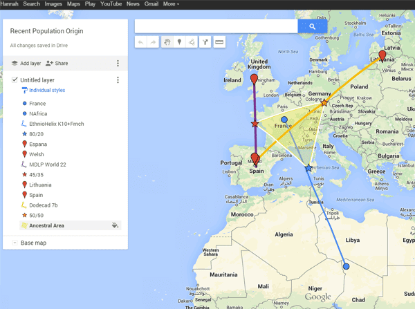
Conversing on Ancestry.com has become even more limited without a subscription much to my annoyance so it will be hard work to find people matching my MRCA to compare mtdna results. Incidentally I noticed that the interactive genealogy map I made sometime ago has a strange overlay with the known path for the development of the H haplogroup both the predominant Eurasian and European subclades. Heatmaping the sources of my major subclade H2a2a has also been helpful though I intend to revise it further with matching recent populations excluding deep ancestry.
_______________________________________________________
http://dna.jameslick.com/mthap/

.jpg)
