I have discovered in running raw data analysis that I love making maps. The heat map in the previous post was overlayed on a known births versus population matching chart. Having found yet another cool map making method I wanted to share it with you all! The goal is to find a common origin based on your largest matching populations. I had to run it twice myself because the first time came out some strange collapsing triangle.
1. Visit GEDmatch (presuming you already have genomic raw data and have an account, otherwise, acquire these)
2. Select Admixture on the main menu.
3. Insert your ID and select any of the open-source projects (MDLP, Eurogenes, Dodecad, HarappaWorld) and then any of the calculators.
4. Once the calculator has finished, click the Oracle button (not Oracle-4) underneath your generated component scores.
5. Scroll down to the bottom and inspect the "Mixed Mode Population Sharing:" results. Pick one, preferably one with the lowest genetic difference (GD) to ensure better accuracy and one which includes non-diaspora/recently non-admixed populations (localising Ashkenazi Jewish or African Americans as a donor population on a map will be difficult due to subjective guidance regarding their placement on a map).
6. Repeat the above with at least two other calculators and keep note of the results. For a minimalist approach, Europeans are better off using Eurogenes, Dodecad and MDLP. South Asians are recommended to have HarappaWorld included. Those from elsewhere in the world are free to use any combination, as none of these are specific for other regions.
7. Download this map (from Wikipedia) or the map below (for McDonald BGA version) and Paint.Net (open-source image editor). Feel free to use another editing software. I prefer Paint.Net because it indicates the 1/3 increments along any line drawn.
8. Open the map with Paint.Net/another image editor. Pinpoint your McDonald BGA average spot or physical ancestral location if desired.
9. With a colour specific to the open-source calculator you're going to use, pinpoint the location where each donor population for your selected Oracle result comes from. If uncertain, look up roughly where they're from (e.g. Pakistani Pashtuns will be around NW Pakistan close to the Afghan border). If a national average (e.g. German_Dodecad), place in the middle of the country.
10. Draw a line between both donor populations. Estimate where on the line you'll fall. Note the numbers are flipped round in practice; for instance, if the Oracle is 70% German + 30% Ukrainian, the spot will end up around the 30% mark on the German end. Make a spot on the line wherever this may be.
11. Repeat steps 9+10 for all the other Oracle runs, remembering to use different colours for the calculators to keep track.
12. Join these spots together with a different coloured line, forming the "bounded area" where your ancestry can be narrowed down from.
13. Completed. Make all the relevant inferences from the results, compare to the additional data in step 8 if present.
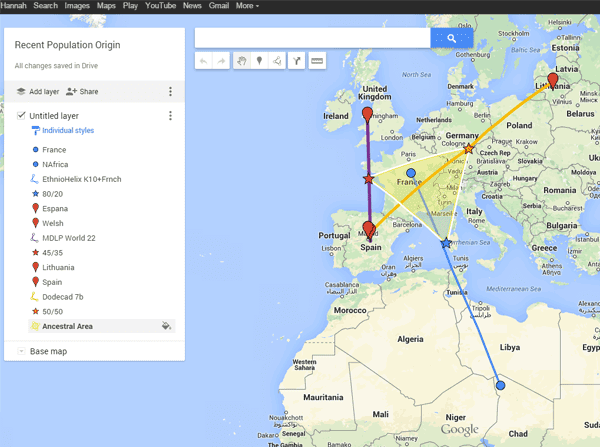 |
| My sample using Google Maps |

No comments:
Post a Comment